
George Cram drew this Diagram of the Principal High Buildings of the Old World in 1897. The obelisk at the back of the picture is the Washington Memorial which perhaps hardly qualifies as 'Old World' - but fair enough, as Cram was based in Chicago we can allow the poetic licence. The colourblocking indicates the material used, with stone as the light yellow and gold as the more intense, darker yellow tone. Pink is granite, although why the Pantheon is classified as granite is anyone's guess. On the right hand side, the central transept of the Crystal Palace looms large, so large in fact that it could clearly contain the dome of the Pantheon. The comparison between St Peter's (Rome) and St Paul's (London) in the centre of the image is also striking, with the London dome looking significantly smaller than its Vatican counterpart. However, the real comparison should be between St. Peter's and Brunelleschi's dome - which, on the right hand side, is just as large but less squat, although its total height is considerably less due to the high drum of St. Peter's. And, on the other hand, St. Paul's is larger and wider than the dome of the Paris Ste Genevieve appearing here on its immediate right; the French dome is a copy of the British original squeezed almost to lantern-like proportions. But perhaps the nicest thing about this drawing is the way Cram, well, crams an array of Gothic cathedrals in the background, making only their spires peek out of the profile of the pyramids. The result here is way more than the sum of the parts and to be honest rather than a diagram we should properly call this a capriccio.

Chateau de Coucy, section and plans.
Form & Barbarism
Viollet Le Duc restored this donjon in the mid-1800s - the original dated back, probably, to the reign of Enguerrand VII at the end of the 1300s. Viollet made it popular (and accessible) although his method might, today, be frowned upon - in any case, we owe to him this delightful set of plans and section. The massive base of the tower gives way to a filigree of gothic arches towards the top, It is a weird hybrid of Scottish castle and French cathedral which, tectonically, makes perfect sense.
The tower was destroyed by the German army during the first World War, in 1917. It took 28 tons of cheddite to blow it up for no better reason than they could just do it and that it would shock people. People were suitably shocked and declared the ruins a monument against barbarism. 99 years afterwards, the story is forgotten, and we still act surprised when we hear that cultural heritage has been destroyed as act of warfare. In fact there's nothing new about it. The Chateau de Coucy has become another cute picture on Pinterest, filed under 'poche plan', 'thick walls', or 'quirky old buildings' - right where one day we'll find all the contemporary acts of destruction that might, one day, be forgotten.
I am not sure if this is a sour story, or if it is sweet - as architecture, form, and beauty did prevail after all.

Solfatara of Pozzuoli from Michele Mercati's (1541-1593) Metallotheca (Rome: Salvioni, 1717).
Burning Ground
The Solfatara of Pozzuoli, near Naples, is an extraordinary place - a volcanic crater characterized by its sulphurous soil. As the shallow crater is also filled with underground water, jets of steam pierce the fragile crust of earth while the ground seems to move, tremble and almost boil, and hot mud often comes to the surface bubbling over. The area is permeated by the strong smell of sulphur. It looks, and feels, like the gates of Hades.

Detail from Solfatara, engraving by Johannes Stradanus (1523-1605), printed by Philip Galle.
The first engraving above, from an original by Mercati, has remained long unknown but until it was rediscovered in the 1700s and copied as one of the plates of Diderot and D'Alembert's Encyclopedie. The beauty of the composition relies on the circular shape of the crater which, in reality, has a more irregular and elongated shape. The Stradanus engraving (detail above - full picture follows), on the other hand, puts less emphasis on the composition and on the crater itself, but is rich in dramatic detail.

Solfatara, engraving by Johannes Stradanus (1523-105), printed by Philip Galle.
Stradanus here is particularly successful at depicting the light, yellowed-out tone of the dirt at the centre of the crater, and its quality - sandy at the top, and moving, almost fluid or liquid just below. He also situates the solfatara in its context, which is actually rather urban. What we see in the picture is probably the town of Pozzuoli and its gulf, looking north-west towards Capo Miseno (top left in the picture). In the image below you can see a detail of Pozzuoli itself.

Detail from Solfatara, engraving by Johannes Stradanus (1523-105), printed by Philip Galle.
And here's a map just to situate the view in a context. The area you're seeing is basically the northern end of the bay of Naples which is bookended by the Vesuvius to the south.

Since antiquity the solfatara has been described as the entrance to the underworld, or to hell. To visit it means to realize that the ground we're on is anything but solid - it is, in fact, an ever-changing subterranean landscape of currents, shifting lava, boiling muds, liquid rock, vaporized water, stinky steam, and more.

Solfatara, copper engraving, 1707. From Les delices de L'Italie (Paris: De Rogissart, 1707).
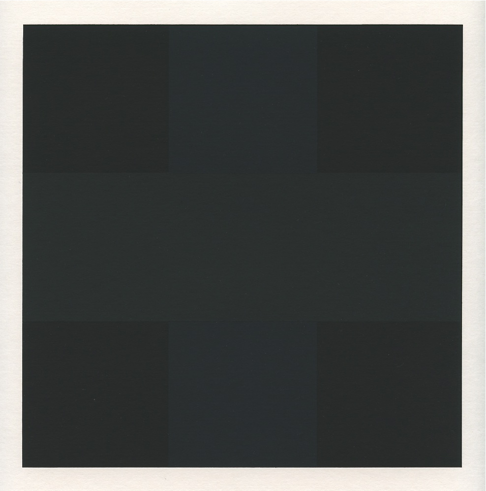
You can't see the cross here, right?
The Cross
Believe me, there is definitely a cross in this Black Square - Black Painting by Ad Reinhardt (1960-1966). If you tilt your screen and squint a bit you will see it. Look around and you will notice that the cross, or the X, is one of the most pervasive spatial archetypes. Howard Hughes used it more than 30 times in Scarface (1932): x shaped shadows and visual compositions mark the movie echoing the scar of the protagonist and becoming the ominous sign of violence and death.

But crosses and Xs for me go well beyond symbolism: they are the most fundamental way to mark a territory, the root of the relationship between landscape and human presence – as in the Roman Cardo and Decumanus. The Cardo and the Decumanus formed a cross that projected on earth an imaginary heavenly order, as seen in this scheme that depicts the foundation ritual of Roman cities.

The Cross is a basic foundation element not only of the western city; most civilizations have produced cross-shaped configurations, and one of the most interesting for me is the city of Anjar (today in Lebanon), founded by Al-Walid I, an Umayyad caliph, in 714-15.
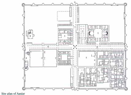
The plan features a central cross-shaped circulation space that we can imagine as an urban interior of sorts. This space manages the walled area by dividing it in four quarters, but it would have also have provided a shared, representative space for both commerce and rituals.
The idea of a space of passage that is both a connector and a symbolic element of sorts re-emerges also in Le Corbusier’s La Tourette Monastery (1956-1960). On the lowest level of the building, a cross of corridors links the four sides of the monastery. I stayed a while at La Tourette in 2003 and I remember ‘discovering’ this shortcut almost by mistake – it was a new way of experiencing the building and understanding the relationship between its parts, and while walking through it, I realized it was a cross and had a sort of ‘whoa’ moment. Cheesy, I know. And stupid, especially, as I should have known the plan of the building as every good architecture student… so, for those of you who have not seen it yet, here it goes.

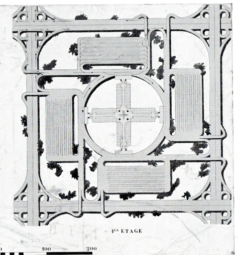
Corbu of course just loved his crosses… as his Ville Radieuse shows clearly (I won’t comment the obvious).

But there are less obvious aspects in this project – especially the monumentalization of car circulation that gave beautiful and scary results such as this one, where the cross becomes the ultimate embodiment of the very mechanical rationale of the city marrying again the symbolic with the prosaic:
Interestingly, Italian architect and critic Gabriele Mastrigli has suggested that Le Corbusier took inspiration for the layout of his City of one Million of Inhabitants from another paradigmatic cross-shaped project:

Bramante’s proposal for Saint Peter (a project on which he worked between 1500 and 1514). An interesting introverted cross, somewhat the opposite of the centrifugal Villa Capra by Palladio (ca. 1567), which becomes a fourfold viewing device open towards the surrounding landscape.

and the maybe not-so-obvious beam-pillar exposed cross of the House on a Curved Road by Kazuo Shinohara (1978).

This section for me is deeply moving – it seems like all the meaning of architecture is condensed in that one beam-pillar cross, the vertical loads and the horizontal ones, the thrust towards the sky and the need to bind all elements together. I always found this building a sort of existential statement on architecture that could belong equally to the Japanese tradition and to a classical genealogy: it is about weight, order, measure, and ultimately also about man – what else could the absurdity of the slanted roof cutting the structure be, if not the intervention of chance, hazard, and the twists and turns of human nature? Uhm, no, this is wrong, one should never write about architecture when architecture is that good. It simply speaks for itself and talking about it can only make it cheap. I feel like thrashing the last lines but I’ll leave them as a memento not to overanalyze again.
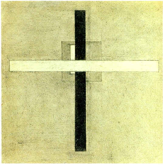
However, especially in the Christian West, the importance of the cross as a symbol cannot be overestimated. Even in the cases in which it is used simply as a formal device, as in this “Composition with Cross” by Suetin (1921-22)
the metaphorical charge is still very much present, inscribing even the most abstract canvas into the history of Crucifixion paintings to which this famous detail from Piero della Francesca’s Pala della Misericordia (1460) belongs.
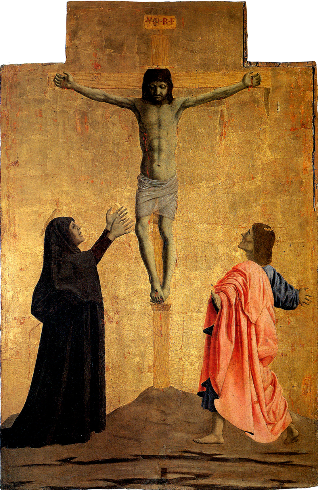
But just to end, here is the cross-based painting that for me remains the most stunning. Naive at first – after all, it’s just a lamb – the canvas is probably one of the most thought-provoking ones I have personally ever seen. There is just no stopping the chain of associations that will burst in the mind of the viewer once the cross formed by the legs of the lamb has been noticed: crucifixion, Jesus, martyrdom, meaning and value of life, this image can start infinite reflections. Francisco Zurbarán takes us on a real tour de-force of formal and conceptual metaphors with his “Agnus Dei” (1635-1640) – see below.


Robert Motherwell, Open (21 Publishing Ltd, 2010).
The Open
I have been trying for a while now to build up a catalogue of spatial archetypes – not necessarily architectural archetypes, just archetypes of organization of space. Formal archetypes, if you like. This interest goes back a long way but, ironically, it was cemented by the discovery of a book devoted to a something that is not normally recognized as an archetype - the figure Robert Motherwell called the Open.

Robert Motherwell, Beige Open, 1981
Motherwell started working on this series around 1967 and developed it for more than 20 years (he died in 1991). I won’t discuss the book – or the paintings per se (by the way, both are amazing), but just the idea of the Open: because it suddenly hit me when I leafed through the book the first time that Motherwell ‘discovered’ an archetype that is at the same time an incredibly simple concept (as an archetype should be) but also, amazingly, one that has never been really discussed – not that I know of. What is the Open? I think it is self-explanatory…
The Open is a rectangle that is, well, open. As in not closed, missing one side, or pushed to the edge of the canvas so that the imaginary fourth side disappears.

Robert Motherwell, Red Open with White line, 1979
We see Open(s) in our everyday life almost everywhere. Open fences, unfinished frames, three-sided piazzas. The section of a glass is an Open. Any room is an Open (provided that it has a door, clearly…). Space is made up of sequences of ‘Opens’ and we hardly ever realize it – hardly ever realize the power of the missing side, of the gap that lets stuff into a space.
These paintings have an astonishing sensual and technical quality but for me they transcend their physical datum because they are the means through which Motherwell exposes, discovers, establishes a whole spatial and formal category.
This was an old post dating back to 2011 - clearly the 'Open' story is still open and needs further investigating...

Firenze, Uffizi. Ground Floor plan. From L. Satkowski, Giorgio Vasari, (Princeton: Princeton University Press, 1993)
Maybe the Uffizi by Vasari can be considered an 'Open'? Somehow it has always felt a little strange to me that only one of the two short sides of this elongated courtyard is closed with an arch. But perhaps this strangeness is exactly the quality of the Open. We should ask Francesco Marullo, author of this nice piece: http://thecityasaproject.org/2012/08/the-office-and-the-loggia-giorgio-vasaris-architecture-for-bureaucracy/ In the meantime, look out for more architectural Open-s...

Savage Events
Superstudio's ideal cities were 12 in the English version, 13 in the Italian version, but rumors of an unpublished 14th city have been circulating for a while. The Last City does exist and will not be a secret for much longer.
Black Square is extremely proud to have the chance to publish, for the first time, this mythical 1978 text within Savage Architecture. Savage Architecture - exhibition and book - is about to be launched with three events this week in London. Authors Gian Piero Frassinelli (former Superstudio), Matteo Costanzo & Gianfranco Bombaci (2A+P/A) and editor Davide Sacconi will be here to explain and discuss the work.
Celebrations will start the Architectural Association on Thursday, 6 pm, with the opening of the exhibition and book launch.
The actual discussion will take place at the Italian Cultural Institute, 39 Belgrave Square, on Friday at 6 pm, with a roundtable debate between Sam Jacob (Sam Jacob Studio), Markus Lahteenmaki (Drawing Matter), Jacopo Benci (British School Rome) and authors 2A+P/A and Gian Piero Frassinelli - chairman Davide Sacconi.
Finally, on Friday, from 10 pm on, we look forward to seeing you at Nomad, 58 Old Street, for a Savage Party with music by Signorina Van de Rohe. During the party, Signorina and AYR (the collective formerly known as Airbnb Pavilion - Alessandro Bava, Fabrizio Ballabio, Octave Pero & Luis Ortega Govela) will play a preview of a Savage Video - we won't spoil the surprise saying who stars in it... but we can promise it's going to be fun.

Signorina van der Rohe: pink is the new black.

Section of he Tower of the Winds from The Antiquities of Athens by James Stuart and Nicholas Revett.
A Timepiece in the form of a Tower
The Tower of the Winds is a timepiece in the form of a building. Vitruvius names Andronicus of Cyrrhus, an expert of astronomy hailing from Macedonia, as its author. Andronicus is recorded as the author of other sundials, including that of the Sanctuary of Poseidon on the island of Tinos, and is probably an actual historical figure who doubled here as architect and technical consultant. Varro writes about the tower around 50 BCE but it is not clear when exactly it had been completed; if it dated to that period, it would mean it belonged to the building programme of the new Roman colonial agora. If we have to agree with Hermann Kienast, who places it about a century earlier, it would have, interestingly, predated the Roman project. All authors however agree on its purpose; the Tower worked as sundial and was topped by a triton-shaped weather vane. Its octagonal plan is a reference to the eight main winds embodied by wind-gods in Greek mythology. The building still stands, but as it has been reused for different purposes in the last 2000 years, it is impossible to reconstruct its original interior and the waterclock that occupied it. In The Antiquities of Athens (1762) the section shows an empty, rather blank space, and only in the plan we see a hint of the machines that would have occupied it originally. It is indeed thanks to this book that the Tower became a popular example of classical architecture; until then, most architects based themselves on Italian examples. John Stuart and Nicholas Revett were the first to publish an extensive report on Greek ruins and the pages they dedicated to the Tower are still compelling today for their clean graphics and fascinating subject matter.

Plan of the Tower of the Winds from Revett and Stuart.
The partnership of Revett and Stuart is the stuff of picaresque novels: while Nicholas Revett (1720-1804) was your typical British gentleman amateur on the Grand Tour, John Stuart's origins were anything but aristocratic. He was in fact the son of a sailor, gifted with unique visual talents; a former painter of fans, he eked out a living in Italy as tourist guide until the fateful meeting with Revett. Eventually, the two would return home to publish their opus magnus and Stuart, nicknamed 'Athenian', would enjoy a couple of colourful decades dividing himself between prestigious design commissions and a rowdy private life (it seems its love of booze and young wenches often stood in the way of completing lucrative jobs). In any case, the book is still today a source of delight: in the case of the Tower of the winds, they represent the building with crisp architectural projections - plan, section, and elevation - without its context. The elevation emphasizes the contrast between the ornate upper part of the tower, and the plainness of its smooth pentelic marble bottom half.

Elevation of the Tower of the Winds.
In the elevation one can also see the sundials etched below the frieze. While the interior presents doric features, the exterior is corinthian. However, the choice of representing plan section and elevation is also symptomatic of the fact that here Revett and Stuart are not simply portraying the building, but rather attempting a reconstruction following literary sources such as Varro and Vitruvius. By the mid-1700s, in fact, the porticoes did not exist anymore, and neither did the bronze weather vane. The authors of the Antiquities show us the actual conditions of the buildings in a perspective view that is a more faithful depiction of the building at the time of their visit.

Vitruvius' obsession with the link between time and space, architecture and calendars, is well known; in Book 1 of De Architectura Andronicus is mentioned with the implicit understanding that he was an unrivalled maestro of clock-building, but Vitruvius also discusses other examples closer to home, including one in Rome, a tower with 12 sides instead of 8, to match a different system of categorization of winds.
After the publication of Revett and Stuart's antiquities, the tower became a popular archetype and was widely copied - there is, for instance, an almost literal copy in Oxford, along with many variations and versions throughout the continent.
An astronomer, an adventurer, and an aristocrat: ironically, none of the men who built this tower and gave it a second life was an architect.

First panel of Elsewhere's triptych entry for the Wakeford Hall Competition:
Architecture Elsewhere
Just last week the Architectural Association announced the winners of the competition for the new Wakeford Hall to be built within Hooke Park, the AA's stunning forest retreat. As we know, the most radical projects rarely take place nr. 1 - but they do, and this time they did, get recognition. In this case we're talking about Elsewhere, whose entry is without doubts the standout project between the four finalists. Elsewhere is headed by John Ng, who has been teaching at the AA since 2012; John's profound understanding of the school, its culture, its quirks, and its uniqueness is what makes this project not only an exuberant and beautiful architectural gift, but also, a celebration of all the AA stands for. The project is constructed as a triptych of three 'experiments' of different duration, a term for the loos (see image above), two years for the library, 56 years for the lecture hall. The loos become an occasion of material experimentation as the students play at building and rebuilding them with ephemeral enclosures. The idea is pure tongue-in-cheek AA, and yet, beyond the irony there is a clear, extreme idea of what architecture is: it's about society (being alone - or not), form (being round, being blue, being pink, being square), and shit (being mortal).
It is also a veiled homage to some of the people who made the AA great in the past: a new City of the Captive Globe, irreverently mixed with Tschumi's La Villette's folies. And the whole project - consciously or not - reads as a fresh re-take on the two best entries of the famous park competition of the 1980s. What if Hooke park is not a park, but, in itself, an event, a project that keeps renewing itself every term, every two years, every century?
In my valley in the Alps the most important religious festival of the year is the feast of St. Bartholomew; the villagers (who to this day remain more pagan than Christian) celebrate it with a bonfire competition that is closer to Beltane than the Church of Rome might really like. The winner is not the largest bonfire, but the most elaborate, the most beautiful, the most poetic. In short, it is all about architecture. An architecture built to be set on fire. Similarly, Elsewhere's toilets are set on fire on Graduation night.

Experiment 2: the two-year library
A library in the form of a forest, and a lecture hall that is a gigantic topiary. The other two slices of the triptych are just as good as the first but we will try not to divulge too many secrets here in case Elsewhere might want to build or publish the project in the near future... which, we can only say, we hope it will be the case.
Elsewhere's work is particularly refreshing in a panorama where it seems that form and content are destined to become opposites both in practice and academia. Their work defies categories: it is socially militant, moulded as it is on an actual project of life before anything else, and yet extremely precise in terms of its aesthetic qualities, down to the graphics and composition of their drawings. The project for Wakeford Hall is very contemporary in its language and materials, and yet beyond its delight in new technologies, it is also clearly the project of architects who master the classical tradition and understand how to play with proportion and symmetry. This formal control is, again, very rare, and it is what makes the whole Elsewhere website a treasure trove of ideas: http://www.architecture-elsewhere.com/
The triptych is also, perhaps, a cautionary tale on the state of architectural education today - from the loos-as-maquettes, to the library which, as the text says: 'may not be very warm, so it is a good idea not to give very long lectures'.


Giovanni Battista Piranesi, Plan of the Mausoleum of Caecilia Metella, wife of Marcus Crassus, from the Roman Antiquities. Published by Angelo Rotili, 1756-57.
Building (almost) without Interior
Caecilia Metella, as all Roman matrons of good family, did not have a name - but she did get one of the most magnificent mausoleums ever built to perpetuate her memory. Or, rather, the memory of her as pure dynastic locus of the merger between the clans of her father, consul Quintus Caecilius Metellus Creticus, and her husband, quaestor Marcus Licinius Crassus. Roman women did not have a praenomen, and were only identified by their father's nomen (representing the gens or clan) and cognomen (the bit that specified to which family, or sub-branch of a clan, one belonged). So you see, this lady did not have a real proper praenomen (let's say, Jane Caecilia Metella, or something), but only the two standard surnames. Men also had a right to a fourth name or agnomen, theoretically a nickname, but in fact a third surname that made the kinship structure even clearer. In any case, her mausoleum dominates a hill along the Appian Way since the first century BC, having been built approximately some time between 25 and 10 BC. The mausoleum is basically a huge tumulus, a drum made out of earth and clad in stone. Still today it looks both imposing and scarily simple, just a very large static mass. However, Piranesi's plate above shows how this building without an interior is far from being a one-liner.
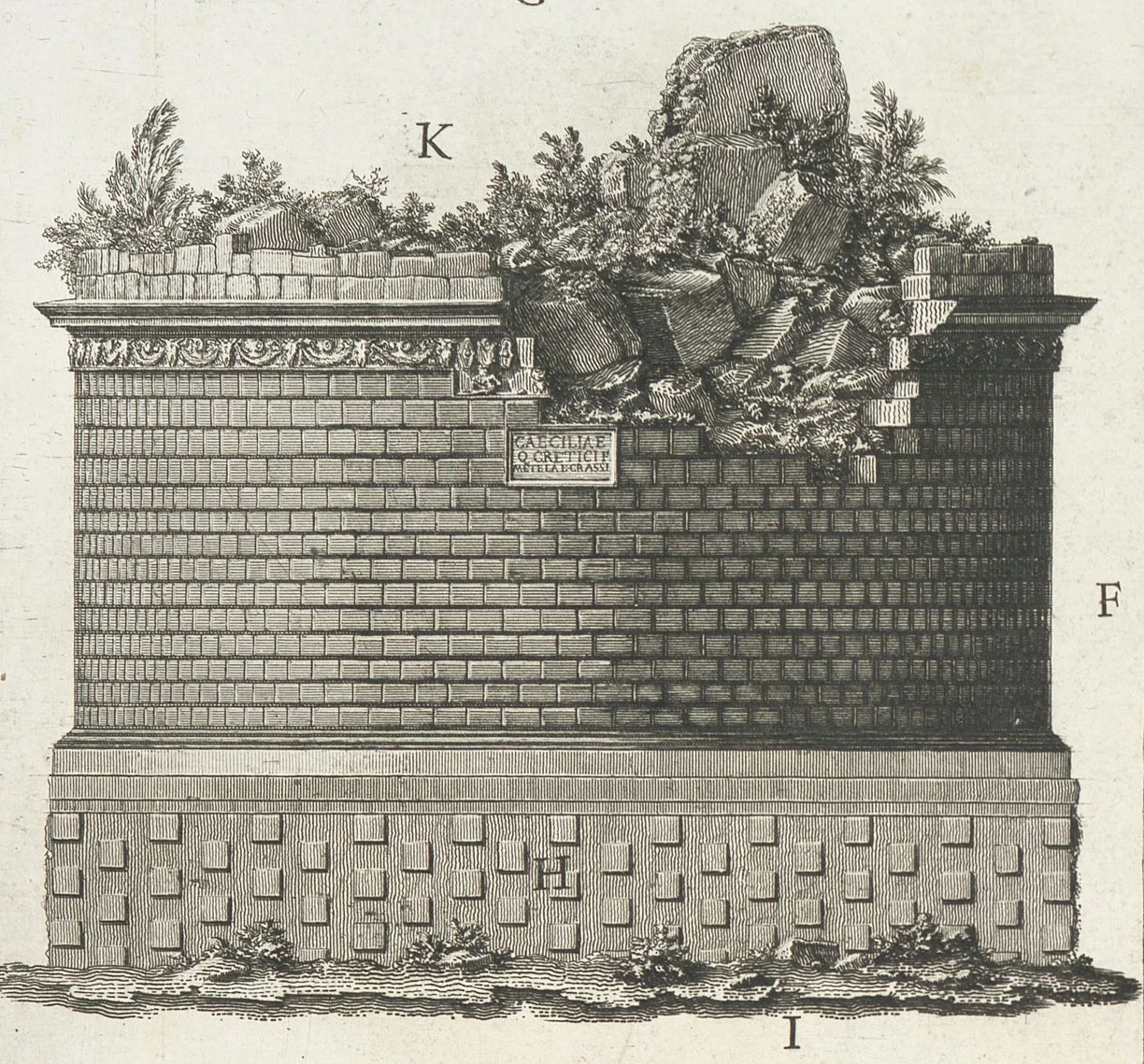
The facade above cannot express the actual size of the building; the diameter is 30 m, the height 20 m. The scale of the stones used is very large, making the image look deceptively normal. In fact, the mausoleum was so big that throughout the middle ages it was used as a fortress, and it had a second life between 1300 and 1500 as centre of the headquarters of the Caetani family. It might not be obvious, but building something this large, even if it is (almost) only a sculpture implies some major engineering challenges.
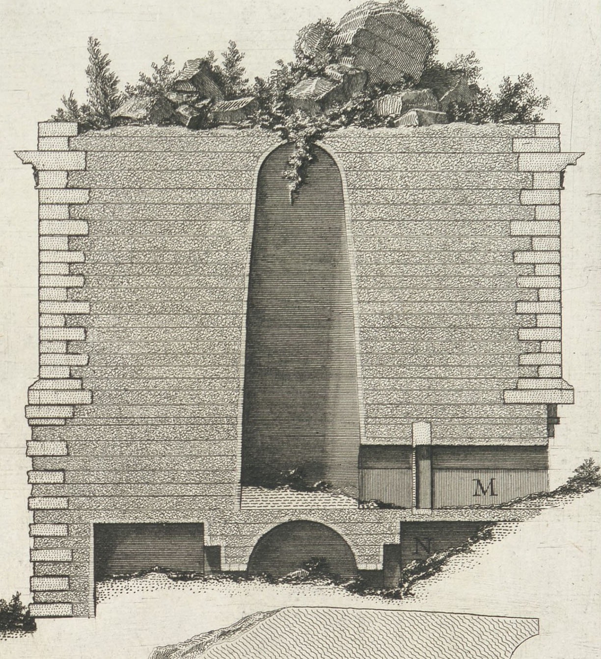
The section is in fact rather inaccurate as the tomb is built on top of a layer of concrete almost 1 m thick laid on top of the existing hill which is made out of volcanic and tuff rock. Although obviously in Piranesi's time analysis techniques were not developed enough to know this, it is still rather surprising to see such a sketchy foundation section as throughout the Roman Antiquities Piranesi is almost more interested in the foundations than in monuments themselves. Still, the section shows the interior of the tomb, with the tapering, tall cella, which would have culminated with an oculus on the roof that was a simple grass-covered mound. This kind of mausoleum was quite popular and Hadrian's tomb - today Castel Sant'Angelo - follows the same model. Perhaps, the mound is a nod to Etruscan tradition?

Caecilia Metella might have never rested in the building - burial customs varied during the centuries of Rome's hegemony and at that point the deceased were most often cremated. Outside of the city walls, the first miles of the Appian Way were bordered by a series of tombs, memorials, cenotaphs, as it was impure to bury the dead in an urban area. In fact some, if not most, of these monuments did not actually mark a burial place but they simply ensured maximum visibility to the family of the deceased. The road was one single monumental space where citizens (and in some case rich freedmen) represented their status. Caecilia Metella's tomb would have stood out also in antiquity, not only for its scale, but for its higher topographic position. Although the tomb has almost no function, and almost no interior, it is still a rather awesome piece of architecture that contains many interesting details, both hidden, and visible.

As a footnote, if you are wondering what's the use of the agnomen or third Roman surname, let us say that this Caecilia Metella could have definitely used one - if only to distinguish her (daughter of Metellus Creticus) from Caecilia Metella (daughter of Metellus Celer). While our Metella was a real lady who only made the news in case of the proverbial 'hatch, match, and dispatch' (so much so that we know nothing at all about her), Metella Celer was a notorious socialite of the 1st century BC. Celer means fast, and indeed Metella Celer was not one to waste time as she happily ignored her own husband to help Dolabella cuckhold his wife. A wife who just happened to be Cicero's daughter... which as you can imagine did not help this Caecilia Metella get the best press. Then again, if the wife was as boring as the father, who can blame Dolabella?
Long story short: don't believe what they tell you about a Roman lady. As they didn't have a proper name and surname, you never know whether you're really talking about the right person.

Antonio Tempesta, detail from Plan of the City of Rome dedicated to Cardinal Camillo Pamphilii (1645).
Rome 1600: Capitolium, with a little Mystery
We just spent some days in Rome for the CAMPO launch of Interior Tales: to celebrate our Roman week, here are a few juicy details from a map by Antonio Tempesta (1555-1630) published by printmaker Giovanni Domenico de Rossi in 1645. These are all details from sheet 4 of the portfolio. Above you can see the Colosseum right at the edge of the inhabited city centre, with Saint Clemente in an almost rural condition behind it.

North of the Colosseum (or left in the case of this map, which is a perspective from the Tiber's Vatican bank) is the church of San Pietro in Vincoli, today embedded in dense built tissue on top of the Oppio Hill.

The Capitoline Hill or Campidoglio is traditionally said to have been redesigned by Michelangelo in the 1530s and 1540s. Something quite weird is going on in this representation, however. On the left, the Palazzo Nuovo (barely a 1-bay affair with a façade to close the square) looks exactly like it does today, and yet books tell us it was supposedly completed only in the early 1660s by Carlo Rainaldi. We cannot see the Palazzo dei Conservatori on the right, but it does look finished, which matches all we know (it is the one piece probably built during Michelangelo's lifetime). But the central Palazzo Senatorio, built on the ruins of the Tabularium, still sports here a rudimentary, unfinished façade, while we know that Giacomo della Porta (who hailed from Lake Lugano like us) completed it in 1605. So...
Anyone able to solve the mystery of this anachronism? By the way, the paving with the large oval pattern was indeed designed by Michelangelo but apparently only realized in the 1900s. Curiouser and curiouser.
The most likely explanation seems to be that the Campidoglio had always been a major propaganda affair. In fact, no actual drawing by Michelangelo has survived, and there is no proof he even really conceived the scheme. The earliest and most famous extant representation (see below) is an engraving by Etienne Duperac dated 1567-69; this engraving has been widely used as advertisement for the papal renovation of what had once been the centre of Rome's civic power. So it seems likely that Tempesta copied Duperac rather than the real thing - even if this still doesn't explain why the Palazzo Senatorio remains in its unfinished state.

Etienne Duperac, Piazza del Campidoglio, 1567-59
Why didn't Tempesta copy the main facade as well? Mystery.

Here's the main square of the Ghetto, 'Platea Iudea' o Piazza Giudea; on the right you can see the wall that divided the Ghetto from the rest of the city, cutting what is today the Piazza delle Cinque Scole (Square of the Four Synagogues) in two parts, the Piazza Giudea inside the precinct, the Piazza dei Cenci outside. Below you can see the sheet in its entirety. The whole portfolio is a real beauty, stay tuned as we'll upload the other folios in the next weeks.


Detail from Landscape with Saint Jerome, by Johannes of Lucas van Doetechum, printed by Hieronymus Cock, 1560 - 1564
Lions, Landscapes and Cocks
Saint Jerome (347-420) is a favourite subject of Christian art and a fascinating character in his own right. He produced the standard Latin version of the Bible known as Vulgata, a controversial text that includes excerpts he translated as well as edited versions of pre-existing translations. He was a classicist, mostly self-taught, and not necessarily an excellent writer nor an unbiased one - we know the Vulgata to be basically a political tool for the diffusion of one official version of the truth. We can say that his literary work makes him one of the most important political figures in the early Church and yet he was also a hermit. His long stay east of Antioch was both a moment of personal growth, as well as an occasion to improve his knowledge of Hebrew and Aramaic (useful for his less-than-ascetic writing career). He then went back to Rome, and lived a few decades the life of a scholar, producing an impressive (at least quantitatively) body of work. Interestingly, he started his Vulgata work when his grasp of languages outside of Greek was less than perfect, and yet he's chiefly known as translator; he is also known as a hermit, although his ascetic phase only took a few years in what otherwise was a very long and very cosmopolitan life. The fact that he is such a complex character makes him an ideal subject for representation. You get St Jerome in a study, clothed like a prince of the Church (Durer, Antonello), but also St Jerome as a John-the-Baptist savage in the wilderness (de Ribera). You can paint him on a strong architectural background indulging in classical details, or surround him with lush vegetation, or with a stark desert background. What's more, he is said to have healed the paw of a lion that became his pet, so the lion is also in the picture.
Here we have two prints produced in the workshop of the saint's namesake Hieronymus Cock (1518-70), a pioneer of printmaking based in Antwerp. Cock is very interesting as he was not only an artist in his own right (see below) but also an entrepreneur who contributed to the commercial revolution in printmaking around the mid-1500s. Above you can see van Doetechum's version of Saint Jerome, printed by Cock. Cock was fundamentally a publisher of art portfolio, a lost tradition that we have half a mind to bring back with Black Square in the future. The image above is just a detail of a larger composition that was titled, as it is visible, "Jerome in the Desert". And yet, Jerome's nice solid desk and writing instruments are placed in a clearly defined architectural space, at a right angle with a set of steps and platforms. As it is conventional, next to him lies a cardinal's hat, a symbol of Jerome's high position in the echelons of the Curia which however makes no sense as cardinals did not even exist back then. And the lion is there. Want to see the desert around Jerome?

Right. Not a desert after all. Rather, a prosperous village with houses and yards and a cloister and a church and even a windmill in the distance - a kind of mixture of Flemish architecture with an Italianate landscape and a couple of camels thrown in as a nod to the Holy Land. But the beauty of the story of St Jerome is that there is nothing strange in this pastiche as his whole life was in fact a colourful and hardly consistent mixture of different places and different roles (anachorite? propaganda agent? poet? hermit? scholar? politician?).
Often Jerome becomes just the excuse to picture a landscape in an era, the 1500s, when landscape painting and etching still did not have the same dignity as religious, historical, or even literary depictions. Hieronymus (Cock) himself used this subject; in his case, Jerome and the lion are protected by thick bushes that form a canopy above ancient ruins.

Hieronymus Cock, Landscape with Saint Jerome, 1552.
The language of this print is quite different, it works much more on the shadows and on complex detailing rather than on the cleaner lines of the Doetechum version. Moreover, while the other print took a contemporary landscape as its main subject, here Cock indulges in a capriccio of ancient ruins.

This is it for today; we will come back both to Hieronymus Cock's career as a printmaker, and to St Jerome as a leitmotiv. On Tuesday we'll be in Rome with Diploma 14 and one of the places we'll visit is the Basilica of Santa Maria Maggiore where St Jerome is buried following the official version, which we very much like to support because it's a beautiful church and it just fits such an interesting character to be buried in a church that is also a palace, that has a back façade which is better than its front, which is very old (as in, contemporary to St Jerome) and yet has been completed a scant two centuries ago.

Detail from Hieronymus Cock
25 sacks of plaster
Let's toast to Black Square's first year!
25 sacks of plaster, cast for The Supreme Achievement's opening
15 spectacular students for our first workshop
12 cautionary tales by our favourite architects to be published next February
8 films redrawn in our new book Interior Tales
4 new partners in crime: our friends at CAMPO
3 months since we became feminists
1 new adventure brewing up with Dogma (surprise)

25 sacks! Lera Samovich & Olivia Marra at CAMPO

The 15 Supreme Achievement participants: Marco Uliana, Lera Samovich, Davide Matteazzi, Claudia Mainardi, Angelica Palumbo, Moad Musbahi, Antonio Laruffa, Hunter Doyle, Marta Kruger, Sofia Pia Belenky, Roberto Boettger, Lukas Akinkugbe, Adriano Tasso, Stefano Madelli and Gerta Heqimi

Francesco Marullo of Behemoth, one of the 12 collectives that took part in The Supreme Achievement (with Sofia Pia and Hunter).

One of the 8 narrative perspectives of Interior Tales (courtesy 2A+P/A).

The CAMPO quartet - Matteo Costanzo, Davide Sacconi, Luca Galofaro and Gianfranco Bombaci.

Black's Maria had a very militant autumn. Here, in her proud feminist bitch act.
The Master of Black Shapes
Ellsworth Kelly died yesterday. His brilliant work is impossible to capture in photos as he strived his whole career to achieve a complete unity of form, colour, and materiality. We could say that you cannot get more abstract than Kelly: his most famous works are shapes made out of aluminium, completely even and smooth in colour. None of the covert symbolism of Ad Reinhardt's ton-sur-ton crosses. None of the histrionics of Barnett Newman's single gesture on his Onements (nor, of course, of Newman's penchant for drama and pretentious references in the choice of titles). None of Rothko's hypnotic landscape-like depth. None of the industrial quality of Donald Judd. None of the geometric rigour of Frank Stella.
However, we could also say that because of this, Kelly was the most concrete of all abstract artists. His work needs to be seen. It cannot be expressed in a sketch, a photo, or a brief description. Its colours are saturated, dense, impossibly even. Others have worked with the idea of a shaped canvas - perhaps Stella most notably - but none as consistently as Kelly. In Kelly's work the aluminium surface is frame and canvas at the same time: shape and substance. Painting and sculpture. It is truly what Judd would call a 'specific object' that is as impossible to categorize with words as it is to record on film. The pieces are large, often in scale with the human body, allowing the viewer to lose himself in the flatness and intensity of their colour. As Kelly himself said, 'the form of my painting is its content'. Many XXth century artists would have liked to be able to say the same, but not many succeeded in this quest as much as Kelly did. In books and websites, his works are sometimes titled 'forms', and sometimes 'shapes' - I am trying to understand whether this is a mistake or a choice. In general terms, shape is defined as the 'outer appearance' of form (which is supposed to be the fixed, unchangeable, and radical base of the shape). As such shape is subject to change but also individual interpretation, whereas form is supposed to carry with it the oneness of Plato's ideas. In any case, Kelly's specific objects could also be interpreted as shapes, perhaps to insist on their possibility to be understood and misunderstood in different ways.
Can we then charge Kelly's work with being 'literal' and lacking 'presentness', as Michael Fried did with most minimalist art? Can we apply Fried's critique to it - namely, can we say these are 'theatrical' pieces that depend on the viewer's presence to have any meaning at all? Perhaps not. While it is true that Kelly's shapes defy digital diffusion and can only be seen in person, this does not mean that they depend on the viewer. On the contrary, their strong formal aspects make them, if anything, very complete in themselves, almost monumental in their precision, smoothness, size, and geometry. They are mysterious and somewhat impenetrable, they exist in and of themselves with a solidity and absoluteness that seems to ignore - rather than challenge - the viewer. They can be interpreted as fragments, of course, and as such they can be seen as 'incomplete'. However this is not at all the impression that they give in real life, as their scale makes them clearly alien to the everyday context. They are obviously manmade, yet also timeless, non-referential.
In this he perhaps managed to do even better than one of the people who inspired him the most as a young artist: John Cage. When Kelly lived in Europe in the 1950s, he looked up to Cage as a mentor and friend and indeed there are similarities between their researches. The attempt to make of art only a frame is something Cage and Kelly shared, albeit in very different ways. Cage himself told an interviewer in 1978 that decades before de Kooning would tease him saying 'it's not like I can do art by simply framing some breadcrumbs', to which Cage took some breadcrumbs from the dinner table, framed them with his fingers, and retorted that it's exactly what one should do. However, Kelly's frames do not play with the aleatory, neither they depend on chance. Kelly made of the frame his main job and that's what makes his work so elusive - but perhaps also so architectural (not theatrical: architectural). On the other hand Cage's music embraced a certain unselfconsciousness and playfulness that are very much part of Kelly's work as well. Without ceasing to be rigorous, Kelly's art has a refreshing effortlessness to it.
Obviously in over 70 years of career Kelly produced works of different kinds but we mainly refer here to his monochrome shapes, which constitute the bulk of his work and he produced in a consistent manner since the late 1950s, never abandoning a clear line of research and yet never repeating himself. The relationship between form and colour in these works is extremely interesting - why should the red panel be triangular, and the yellow rectangle with two filleted corners yellow? Is it an attempt to make different forms of perception coincide syaesthetically, or is it the ultimate demonstration of the fact that our understanding of colour is historically constructed? In this, his monochromes are much more challenging than others (from Ryman to Klein).
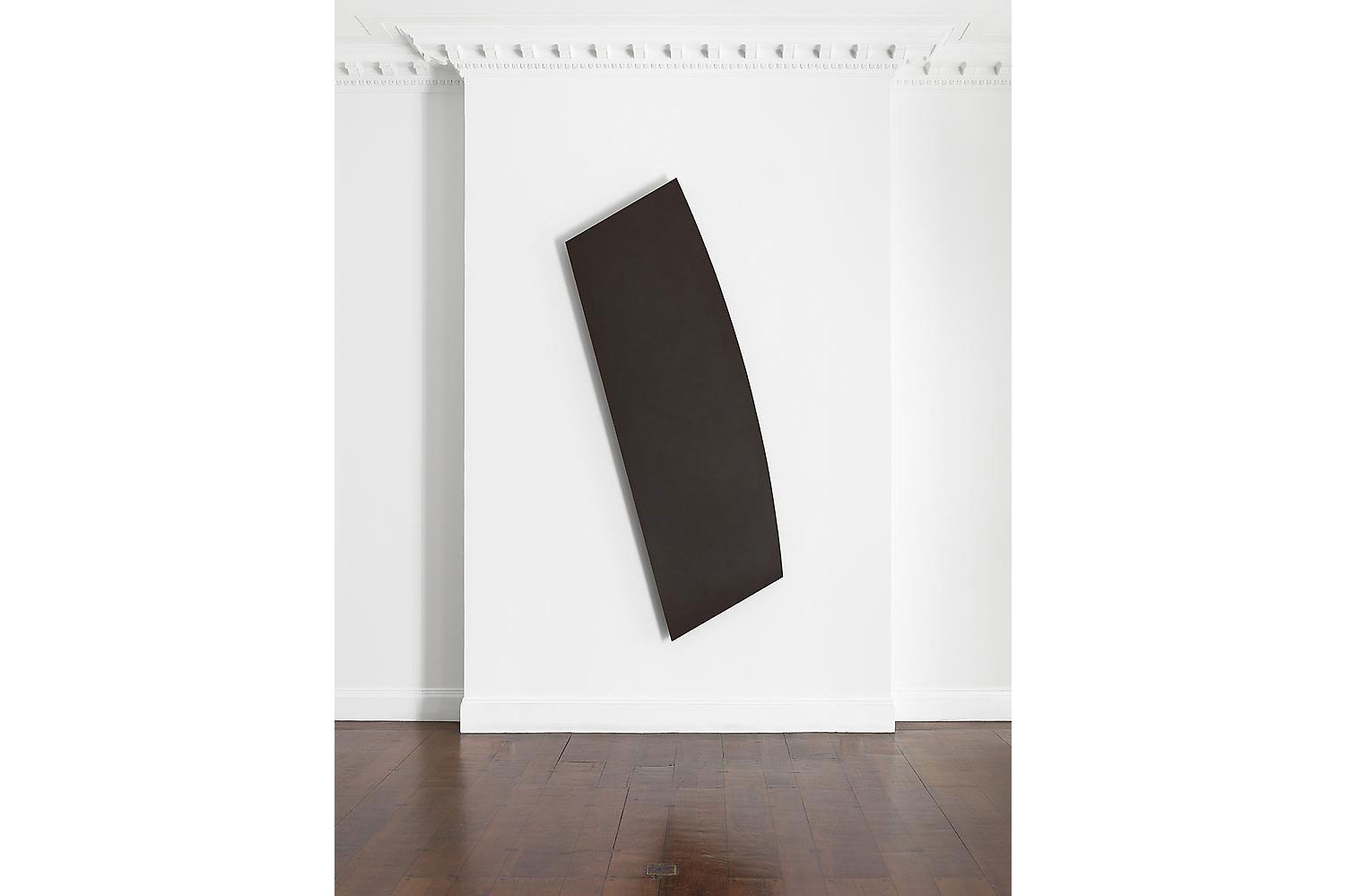
He often worked with black but as you can expect his black artworks (paintings? sculptures? objects?) are never really square.

Nick Walters, the studio manager of Ellsworth Kelly, at work.


Ellsworth Kelly, Black Form, 2011.
Ellsworth Kelly, Black Shape from the Mnuchin Gallery Singular Forms 1966-2009 exhibition (2013).

Dark Blue Panel, Dark Green Panel, Red Panel, 1986.

Ellsworth Kelly, The Mnuchin Gallery Singular Forms 1966-2009 exhibition (2013).

The Next Big Thing
Another gift: Diploma 14's Louise Underhill is featured in Wallpaper's yearly guide to the best design graduates! Louise's project was a radical rethinking of the London terrace. She substituted the party wall with a modular system of concrete panels; this system creates a series of enfilades which can accommodate unorthodox family arrangements. The result is a space which is monumental in scale, rejecting the standard bourgeois room for a set of 5x5x5 halls that can host smaller scale, room-like impermanent structures in between furniture and architecture.

Louise's thesis is particularly representative of the research Diploma 14 has been developing in the last few years. We have been working on the relationship between housing typology and forms of life - a theme that is well expressed in Louise's work which uses a tectonic invention to address what is ultimately a problem of subjectivity. This is why it is such a joy to see her project featured in a commercial magazine: it feels like many years of discussion, and the collective intelligence of a few generations of Dip 14, are going out there in the world and making their appearance even in mainstream media (which, as we know, is 'almost alright').

In the last years we have focused on the scale of the dwelling; this year, we hope to try to link this kind of typological experimentation with a stronger large-scale strategy. So, watch this space, as we are indeed always looking forward to the next big thing.
Cover of Inigo Manglano-Ovalle's The Black Forest.
Black Cube
If #gift n.1 came from Italy, #gift n. 2 is straight out of Spain thanks to our friend Alvaro Velasco-Perez. It is a lovely, lovely book, the catalogue of an exhibition at the University of Navarra in Pamplona (unfortunately this one just closed at the end of July). Madrid-born Manglano-Ovalle is an artist based in Chicago; for The Black Forest he created a suite of works linked by the use of charcoal as key material.
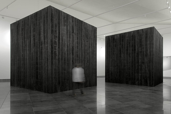
The exhibition was dominated by two 5x5x5m cubes lined with charred beech wood which looks, in turn black, grey, or silvery depending on the light. Manglano-Ovalle says that the cubes are meant to be at the same time sculptures and pieces of architecture. He paired these sculptures (or, as Donald Judd would say, 'specific objects') with a series of photographs that look just like, well, black squares.
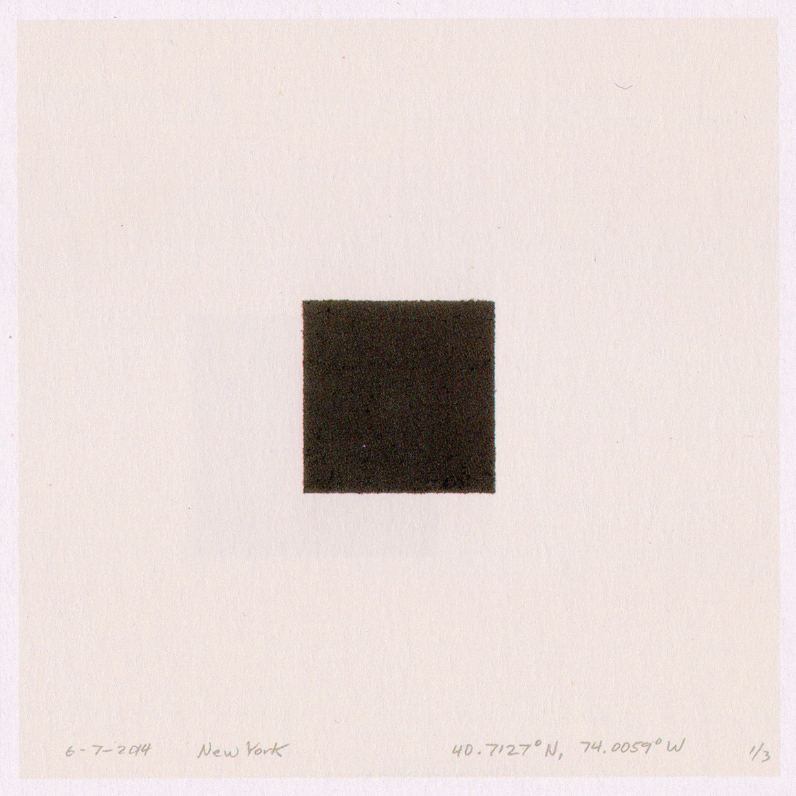
Inigo Manglano-Ovalle, 6-7-2014, New York
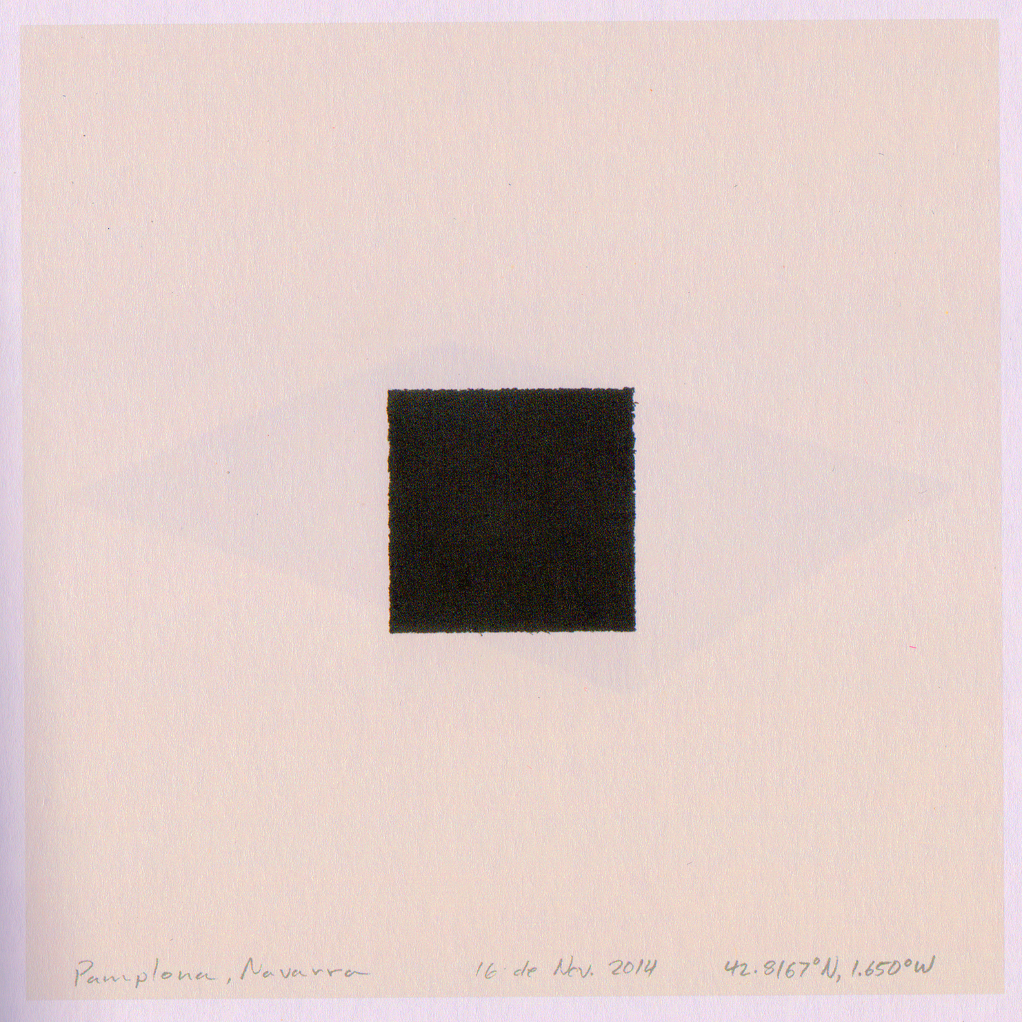
Inigo Manglano-Ovalle, Pamplona, Navarra, 16 de Nov. 2014.
The images are in fact carbon impressions taken in different places and at different times - 'indexical impressions of the sky' as Manglano explains. They are all black and yet they are not exactly the same. It is impossible to convey these differences by posting scanned pages f the catalogue, and probably nothing can compare the real experience of seeing these images in person. Carbon becomes not only the theme of this imaginary forest - burned, the artist seems to suggest, by the arrogance of mankind - but its very body, its texture. The idea of a black photo is haunting, like an ultimate, super-dense black square that is supposed to contain a secret image, or perhaps all the possible images one can imagine, collapsed in one frame.

The exhibition at the Faculty of Architecture, University of Navarra, Pamplona.

We cannot thank Alvaro enough for this fantastic surprise. It really is a unique addition to our personal collection of black squares.

Drawing by Cherubino Gambardella
Naples as a paradigm
The first gift we received this season comes from Naples thanks to Cherubino Gambardella via Michela Bonomo. Volando sulla Megalopoli (Flying over the Megalopolis) gathers the projects produced for an exhibition that is still on show at the Cloister of Santa Maria La Nova in Naples: the exhibition closes Jan 7, 2016, so there are still a few weeks to visit it. If you happen to be in Naples, it is definitely a must! The work curated by Gambardella stands out as one of the most interesting recent attempts to discuss the urban condition in Italy. In Volando sulla Megalopoli Gambardella invites eleven architects to take a position vis-a-vis contemporary Naples using text and drawing, in a non-literal, imaginative way; the work is completed by eleven large models that illustrate in three dimensions an exemplary fragment of the vision of the author. While the work is very site-specific, we think it is not out of place to read in it a larger ambition to say something about the urban condition in Europe at large: Naples as a paradigm.

Close-up of the model illustrating Beniamino Servino's entry.
Naples is unique and yet exemplary: a law onto itself, the most and least Italian city, the most beautiful and the most ravaged by random development. The idea of constructing a sort of polyphonic project for Naples recalls Roma Interrotta and yet feels refreshingly bold and contemporary because of both the multimedia content and the subject itself - a city that is just impossible to define once and for all. Naples has it all, the very best architecture and a stunning landscape: it also has one of the deadliest volcanos in the world, and a too-complex-for-words social situation. Gambardella's drawing (above) is a perfect portrait of the complexities and contradictions of Naples. A couple of centuries ago, most big cities in Italy were all about gold and dirt - Venice, Rome, Palermo - but now perhaps Naples has remained the only place that can claim that. The book makes the potential of this condition all the clearest for avoiding data, statistics, and worn technical attempts at a 'scientific' analysis: its intelligence is all in the attempt to mobilize the visionary capital of the place.

Image by Lorenzo Capobianco.
The eleven positions are by no means homogeneous: from Beniamino Servino's sophisticated critique of the relationship between past and present, to Lorenzo Capobianco's plea for a rediscovery of collective open air space, from Maria Gelvi's hypothesis for a rethinking of residential sprawl, to Concetta Tavoletta's proposal for the decaying industrial heritage. These differences are what makes the book particularly compelling. We haven't visited the exhibition yet, but it looks like a very successful installation that makes the most of a stunning historical location and completes it with a gold-painted structure that is a nod to the city's rococo legacy. This is very much a choral piece of work; and yet, Gambardella's passion and commitment are very evident and function as the necessary link between the individual positions. Gambardella's own drawings stand out for their irony and confidence, pairing a Serlio fragment with a brightly coloured hand sketch. They make us smile and hope the best for Italy: to grow out of what Kant would call its 'self-incurred immaturity' without losing its sprezzatura. Thank you Cherubino for this gift!

Draawing by Cherubino Gaambardella.

Detail from Beijing Greater by James Mak
The Nomos of the Earth - End-of-Term Crit
Join us on Tuesday, December 15, for a day of discussions on the architecture of the territory at the Architectural Association, 32 Bedford Square, Second Floor, Back Room (10.30 - 13 / 14-17.30). Diploma 14 and guest critics Martino Tattara (Dogma), Francisco Sanin (Syracuse University), Francesco Marullo (Behemoth) and Tom Weaver (AA Files) will discuss the work produced during term 1. Each student has studied a specific territory, portraying it through both geographic and interpretative maps. From Seoul to Bucharest to Shiraz, we have found plenty of exciting grounds for a future project. In particular, the production of a set of 'analogical maps' like the one above has been a new adventure for the unit.

Isaak Ouwater, The Bookshop and Lottery Agency of Jan de Groot on Kalverstraat in Amsterdam (1779).
Grid / Facade
This is not the Amsterdam of the Golden Age - it's the late 1700s and the Netherlands have by now become rather marginal to the artistic debate in Europe. However, this rather anecdotic painting by Isaak Ouwater still manages to surprise us by its frontality and flatness. The façade becomes a grid, and instead of offering us a glimpse of the domesticity it protects it only displays an array of empty, dark, abstract rectangles. This is quite striking as the culture of the window is still very strong today in the Netherlands: device to see and to be seen, expression of the ideology of transparency, openness, and directness that has inspired the most heroic moments of Dutch culture from the age of Vermeer to that of the Superdutch.
The painting is striking in and of itself for its composition and abstraction, but, on top of that, it also shows a certain resilience of Dutch visual culture even beyond these moments of glory. Which is, hopefully, somewhat encouraging if we think about the contemporary condition.

Kubo Shunman (1757-1820), Saddle, Horse-Dipper and Other Harness (1800 circa).
Still life
Kubo Shunman was active during the Edo period and left behind a significant corpus of drawings and prints. He excelled at woodblock printing; during his lifetime, coloured woodcuts of the kind we show here were called surimono and had a wide audience between educated and wealthy Japanese classes. Having been educated during the 1780s, his style would be marked by the muted palettes encouraged by Tenmei-era regulations. During this period, the shogunate tried to force artists to use only a limited number of colours, so much so that an actual genre was born out of these laws, called beni-girai-e (literally, red-hating pictures). As you can see here, Shunman did use red, but in most of his work he is always careful to omit at least one fundamental hue, giving the canvas a washed out, flattened, very graphic effect. It is hard to say if in these depictions of everyday objects the prevailing feeling is a dry irony, or a certain affection and fascination for the details of everyday life.

Kubo Shunman, Outfit for Travel (1800 circa).

Kubo Shunman, Picnic Outfit (1800 circa).

A House for Doing Nothing
Aristide Antonas, one of the best contemporary voices in Europe, will give a seminar today at the AA within the framework of the 'City/Architecture' PhD. Aristide's is one of the 12 practices we invited to contribute to The Supreme Achievement so we will definitely be there to hear him discuss domesticity, form, and the nature of his own work which uses our favourite media - drawings and text - as key instrument.
The seminar is titled A House for Doing Nothing and it will take place in 33 Bedford Square, First Floor Front, at 6 pm.
“The consequences of a post network social sphere coincide with a different urgency for housing. A silent transformation of the concept of the minimal is operated in the interior of the domestic space. The role of the furniture is re-examined while the inhabitants became users of a different infrastructure. What would this condition of inhabitation mean for the recent radical decline of the west and the new relations between North and South?”